A great logo does more than look good. It tells a story. Designers often conceal subtle symbols, meanings, or clever visual puns within logos that most people overlook.
These hidden messages create layers of connection between brand and audience. Once you spot them, you’ll never see these logos the same way again.
FedEx: The Arrow of Progress
At first glance, the FedEx logo looks simple: bold letters in purple and orange. But look closely between the “E” and “x,” and you’ll see an arrow formed by the negative space. It symbolizes precision, speed, and forward motion—everything the company stands for.
Read The Weird Science Behind Common Optical Illusions for why your eyes love hidden shapes.
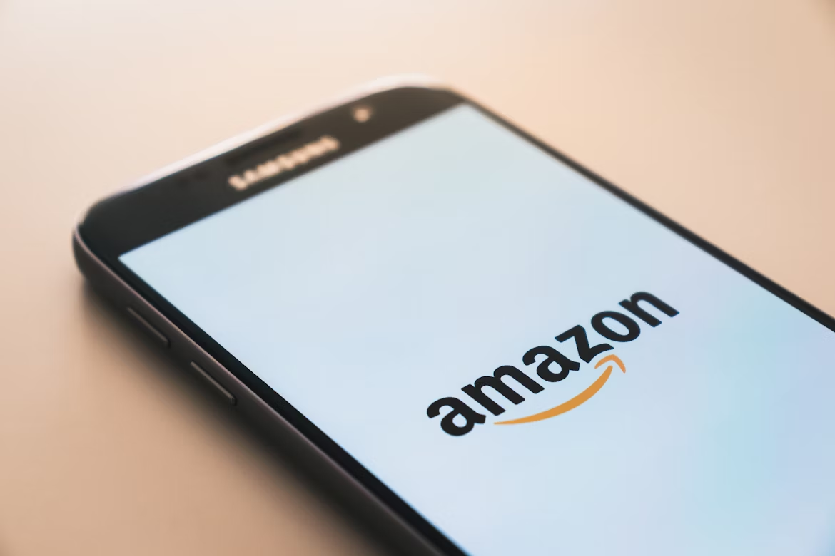
Amazon: From A to Z
Amazon’s cheerful orange arrow does double duty: it forms a smile and also points from “A” to “Z,” representing the company’s vast inventory. It’s a subtle way to say they sell “everything from A to Z” while projecting friendliness and customer satisfaction.
Toblerone: The Hidden Bear
The Toblerone logo features a majestic mountain inspired by Switzerland’s Matterhorn. Hidden within the mountain’s silhouette is a bear. The animal is a nod to the city of Bern, where the chocolate originated. The bear represents both the city’s symbol and the chocolate’s Swiss heritage.
Baskin-Robbins: The Secret 31
The pink and blue “BR” in the Baskin-Robbins logo hides a pink number “31” in the middle. It stands for their original 31 ice cream flavors. There is one for every day of the month. Sweet design, literally.
Curious how fiction becomes tech reality? See Everyday Gadgets That Were Sci-Fi First.
Toyota: The Hidden Ties
Toyota’s three overlapping ovals form the company’s “T,” but there’s more: every letter of “Toyota” can be found within the logo’s curves. The design also represents the unification of customer and company, with a global ring encircling both.
Pinterest: The Digital Pushpin
That familiar “P” in Pinterest isn’t just a letter. It’s a stylized pushpin. The visual pun connects the brand’s name (“to pin your interests”) with the act of pinning images to a board. Simple, clever, and instantly memorable.
Hyundai: A Handshake in Disguise
The “H” in Hyundai’s logo does more than represent the company’s name. It subtly depicts two people shaking hands. One is a company representative, the other a satisfied customer. It’s a message of trust and partnership hidden in plain sight.
Check out Secret Rooms and Hidden Passages in Famous Buildings for real-world hidden details.
Beats by Dre: The Head and Headphones
The red circle with a lowercase “b” in the Beats logo appears to be a simple emblem. But the circle represents a human head, and the “b” forms a headphone earpiece. It’s a minimal yet brilliant depiction of how the product looks in use.
Wendy’s: The Hidden “Mom”
Look closely at the collar on Wendy’s shirt in the logo, and you’ll see the word “MOM” spelled in the folds. The detail emphasizes the brand’s “home-cooked” image and friendly, family-oriented atmosphere.
For more interesting tidbits, browse Five-Minute Curiosity — Things You Can’t Unsee Once You Know.
LG: The Face Behind the Logo
The LG logo hides a smiling face made from its initials—“L” forms the nose, and “G” outlines the face. It symbolizes approachability and human connection, reflecting the brand’s motto: “Life’s Good.”
The Power of Clever Design
Hidden messages in logos create an extra spark of recognition. They reward observant customers and add meaning beyond the surface. Great design doesn’t just represent a name. It tells a story, builds trust, and sometimes makes you smile once you finally see what was there all along.


